A curated library of pre-styled, reusable Flutter widgets organized based on Atomic Design principles to build apps at scale.
Learn more at atomsbox.com!
Getting started
To use any pre-styled component from atomsbox, follow these steps:
- Add the latest version of the package in your
pubspec.yaml:
dependencies:
  atomsbox: <latest_version>
- To keep atomsbox design, import the package and use the pre-defined theme from the library
import 'package:atomsbox/atomsbox.dart';
import 'package:flutter/material.dart';

void main() {
  runApp(const MyApp());
}

class MyApp extends StatelessWidget {
  const MyApp({Key? key}) : super(key: key);

  @override
  Widget build(BuildContext context) {
    return MaterialApp(
      theme: AppTheme.theme,
      darkTheme: AppTheme.darkTheme,
      themeMode: currentMode,
      home: const HomeScreen(),
    );
  }
}
Usage
Three examples of how to use atomsbox components in your Flutter apps. More components are available, check the component gallery at atomsbox.com!
Create an AppCardImageAndContentBlock pre-styled component
AppCardImageAndContentBlock(
  margin: const EdgeInsets.only(bottom: AppConstants.sm),
  headline: AppText('This is a card'),
  subhead: sampleText,
  actions: [
    AppFilledButton(
        onPressed: () {}, child: AppText('Action 1')),
    AppFilledButton.gradient(
        onPressed: () {}, child: AppText('Action 2')),
  ],
),

|
Create an AppForm pre-styled component
AppForm(
  title: AppText('This is a form'),
  description: AppText('This is a form description'),
  formButton: AppFilledButton(
    onPressed: () {},
    child: AppText('Submit'),
  ),
  formItemNames: const ['One', 'Two', 'Three'],
  formItems: [
    AppTextFormField(),
    AppTextFormField(),
    AppTextFormField(),
  ],
),

|
Create an AppTab pre-styled component
AppTab(
  tabs: [
    Tab(
      icon: Column(
        mainAxisAlignment: MainAxisAlignment.spaceAround,
        children: [Icon(Icons.code), AppText('Atoms')],
      ),
    ),
    Tab(
      icon: Column(
        mainAxisAlignment: MainAxisAlignment.spaceAround,
        children: [Icon(Icons.code), AppText('Molecules')],
      ),
    ),
  ],
  children: [
    Column(
      children: [
        AppCard.elevated(
          height: 300,
          width: double.infinity,
          child: Center(child: AppText('Atoms')),
        ),
      ],
    ),
    Column(
      children: [
        AppCard.elevated(
          height: 300,
          width: double.infinity,
          child: Center(child: AppText('Molecules')),
        ),
      ],
    ),
  ],
),

|
Apps built with atomsbox
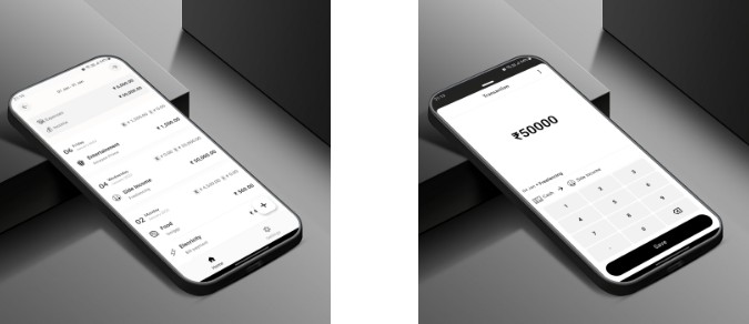
- Music App – an example of how to build a music app UI with atomsbox components.

|

|
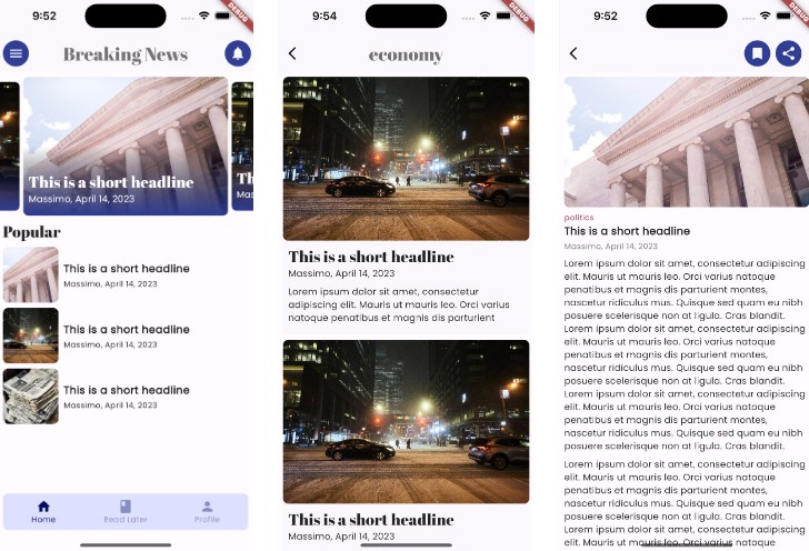
- News App – an example of how to build a news app UI with atomsbox components.

|

|

|
Components & Examples
Contributions are welcome! However, you can also request new components by opening a new issue and describing the desired component: Request a feature
Here is an extensive list of the currently available pre-styled components with their respective examples!
| Category | Component |
|---|---|
| atoms | App Text |
| atoms | App Image |
| atoms | App Icon Button |
| atoms | App Text Button |
| atoms | App Elevated Button |
| atoms | App Filled Button |
| atoms | App Outlined Button |
| atoms | App Card |
| atoms | App Glass |
| atoms | App Gradient Background |
| atoms | App Slider |
| atoms | App Text Form Field |
| atoms | App Gradient Text |
| atoms | App Label |
| molecules | App Expansion Tile |
| molecules | App Segmented Button |
| molecules | App List Tile |
| molecules | App Card With Image And Content Block |
| molecules | App Card Image Overlay |
| molecules | App Text Block |
| molecules | App User Card |
| molecules | App Search With Autocomplete |
| organisms | App Form |
| organisms | App Grid |
| organisms | App List |
| organisms | App Drawer |
| organisms | App Bottom Nav Bar |
| organisms | App Data Table |
| organisms | App Carousel |
| organisms | App Tab |
| organisms | App Audio Card |
Contributions
Contributions are welcome! If you find a bug, have a feature request, or would like to improve the package, go ahead and create a new issue:
- Report a bug
- Improve documentation
- Request a feature
- Optimize the performance of existing components
- Enhance the test suite of the package
Feel free to get in touch to discuss more, email at: [email protected]
