Flutter Zoom Drawer
A Flutter package with custom implementation of the Side Menu (Drawer).
Getting Started
To start using this package, add flutter_zoom_drawer dependency to your pubspec.yaml
dependencies:
  flutter_zoom_drawer: '<latest_release>'
Features
- Simple sliding drawer
- Sliding drawer with shadows
- Sliding drawer with rotation
- Sliding drawer with rotation and shadows
- Support for both LTR & RTL
Documentation
    ZoomDrawer(
      controller: ZoomDrawerController,
      menuScreen: MENU_SCREEN,
      mainScreen: MAIN_SCREEN,
      borderRadius: 24.0,
      showShadow: true,
      angle: -12.0,
      backgroundColor: Colors.grey[300],
      slideWidth: MediaQuery.of(context).size.width*.65,
      openCurve: Curves.fastOutSlowIn,
      closeCurve: Curves.bounceIn,
    )
| Parameters | Value | Required | Docs |
|---|---|---|---|
controller |
ZoomDrawerController |
No | Controller to have access to the open/close/toggle function of the drawer |
mainScreen |
Widget |
Yes | Screen containing the main content to display |
menuScreen |
Widget |
Yes | Screen containing the menu/bottom screen |
slideWidth |
double |
No | Sliding width of the drawer - defaults to 275.0 |
borderRadius |
double |
No | Border radius of the slided content - defaults to 16.0 |
angle |
double |
No | Rotation angle of the drawer - defaults to -12.0 - should be 0.0 to -30.0 |
backgroundColor |
Color |
No | Background color of the drawer shadows - defaults to white |
showShadow |
bool |
No | Boolean, whether to show the drawer shadows - defaults to false |
openCurve |
Curve |
No | open animation curve - defaults to Curves.easeOut |
closeCurve |
Curve |
No | close animation curve - defaults to Curves.easeOut |
Controlling the drawer
To get access to the drawer, and be able to control it, there are 2 ways:
- Using a
ZoomDrawerControllerinside the main widget where ou have theZoomDrawerwidget and providing it to the widget, which will allow you to trigger the open/close/toggle methods.
    final _drawerController = ZoomDrawerController();

    _drawerController.open();
    _drawerController.close();
    _drawerController.toggle();
    _drawerController.isOpen();
    _drawerController.stateNotifier;
- Using the static method inside ancestor widgets to get access to the
ZoomDrawer.
  ZoomDrawer.of(context).open();
  ZoomDrawer.of(context).close();
  ZoomDrawer.of(context).toggle();
  ZoomDrawer.of(context).isOpen();
  ZoomDrawer.of(context).stateNotifier;
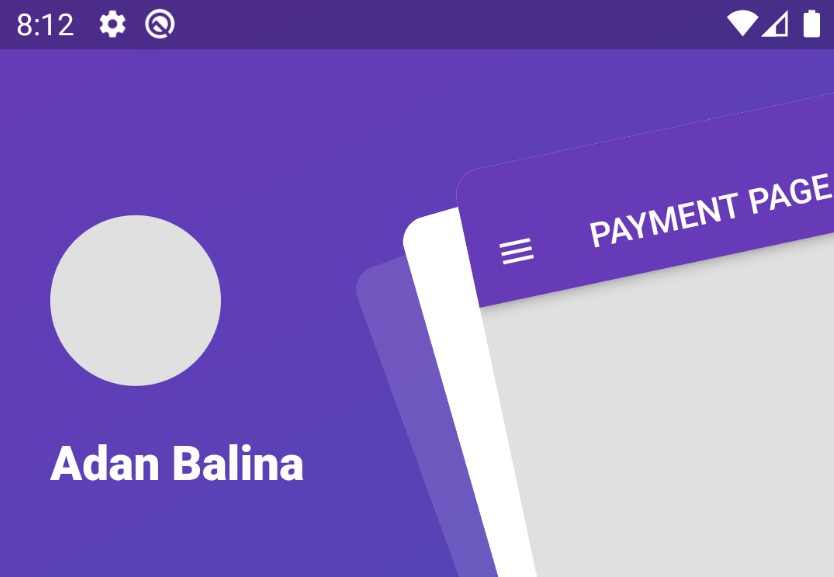
Screens
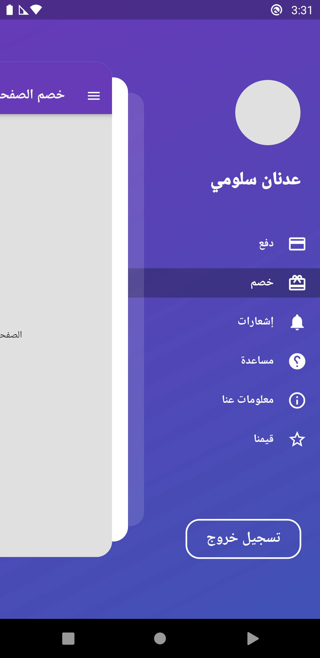
- Drawer Sliding
    ZoomDrawer(
      controller: ZoomDrawerController,
      menuScreen: MENU_SCREEN,
      mainScreen: MAIN_SCREEN,
      borderRadius: 24.0,
      showShadow: false,
      angle: 0.0,
      backgroundColor: Colors.grey[300],
      slideWidth: MediaQuery.of(context).size.width*(ZoomDrawer.isRTL()? .45: 0.65),
    )
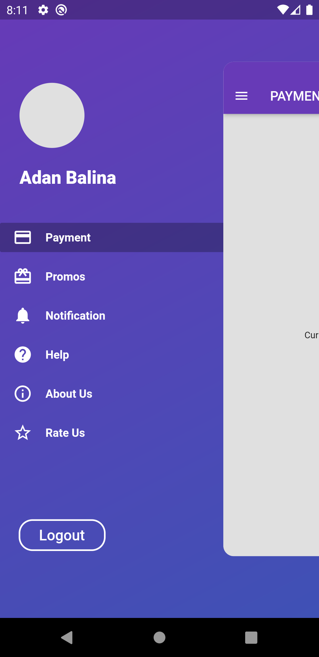
- Drawer Sliding with shadow
    ZoomDrawer(
      controller: ZoomDrawerController,
      menuScreen: MENU_SCREEN,
      mainScreen: MAIN_SCREEN,
      borderRadius: 24.0,
      showShadow: true,
      angle: 0.0,
      backgroundColor: Colors.grey[300],
      slideWidth: MediaQuery.of(context).size.width*(ZoomDrawer.isRTL()? .45: 0.65),
    )
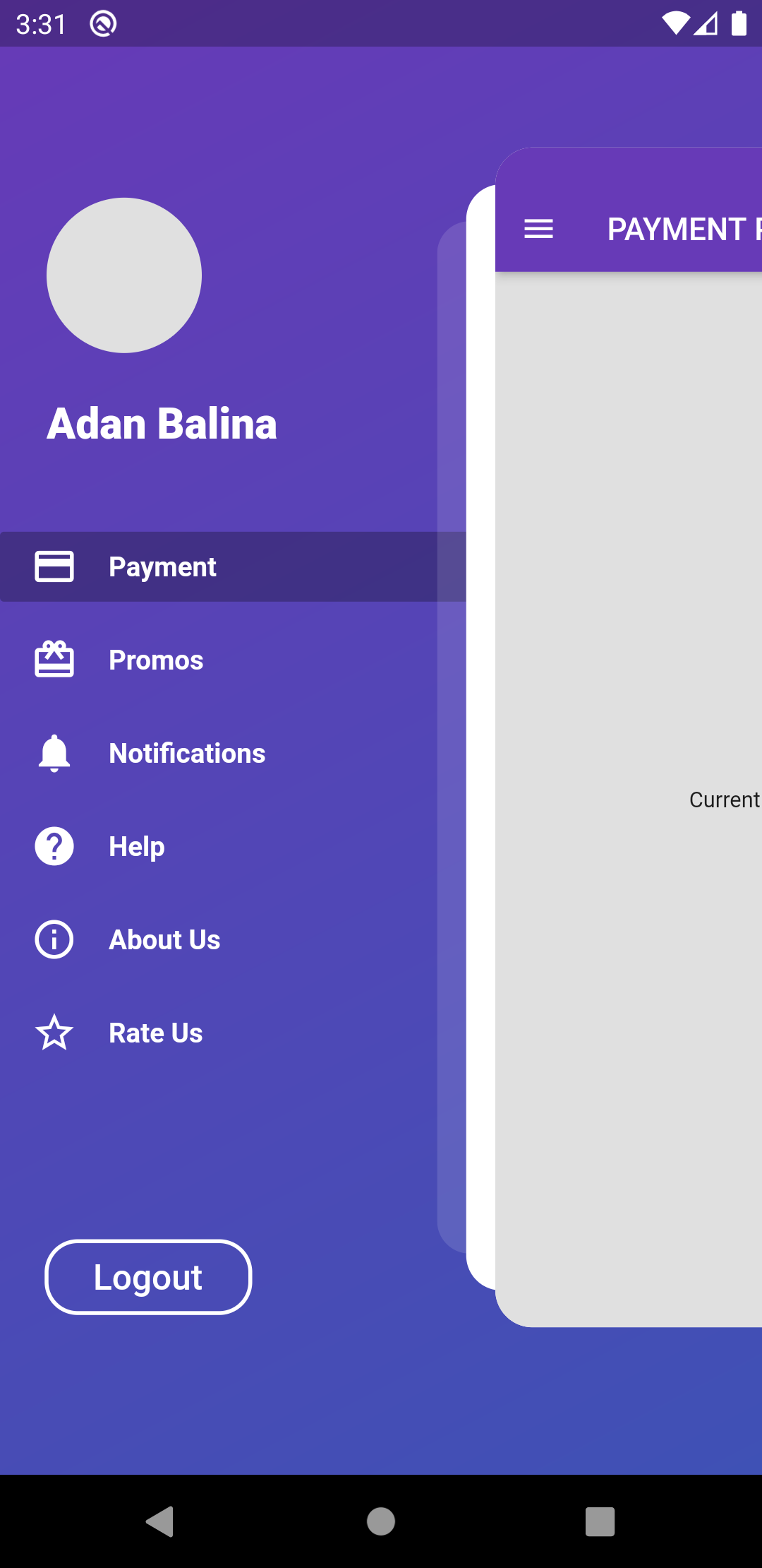
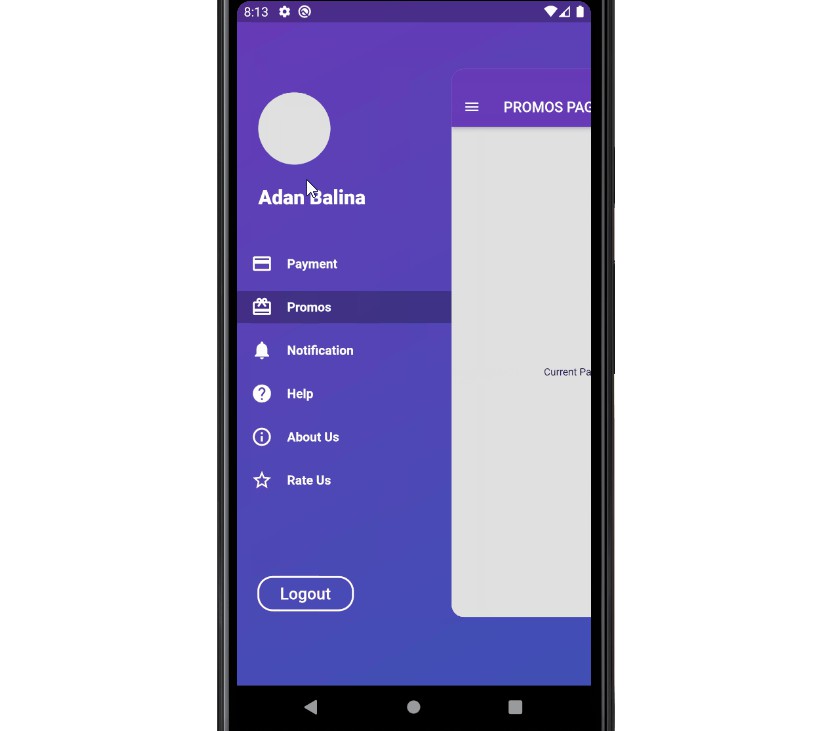
- Drawer Sliding with rotation
    ZoomDrawer(
      controller: ZoomDrawerController,
      menuScreen: MENU_SCREEN,
      mainScreen: MAIN_SCREEN,
      borderRadius: 24.0,
      showShadow: false,
      angle: -12.0,
      backgroundColor: Colors.grey[300],
      slideWidth: MediaQuery.of(context).size.width*(ZoomDrawer.isRTL()? .45: 0.65),
    )
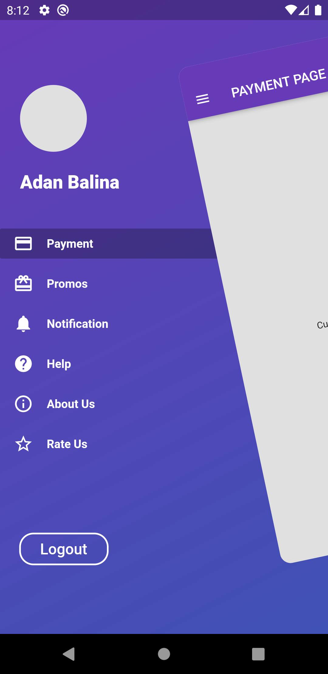
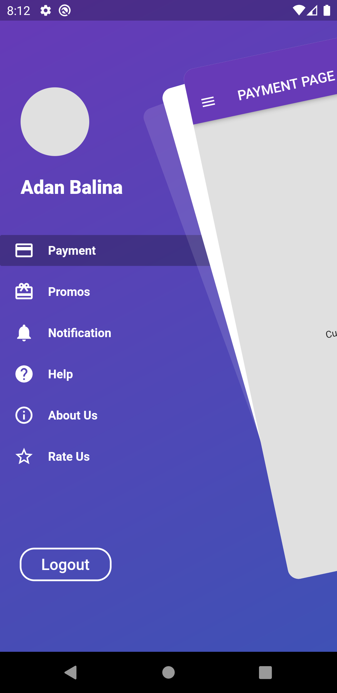
- Drawer Sliding with rotation and shadows
    ZoomDrawer(
      controller: ZoomDrawerController,
      menuScreen: MENU_SCREEN,
      mainScreen: MAIN_SCREEN,
      borderRadius: 24.0,
      showShadow: true,
      angle: -12.0,
      backgroundColor: Colors.grey[300],
      slideWidth: MediaQuery.of(context).size.width*(ZoomDrawer.isRTL()? .45: 0.65),
    )