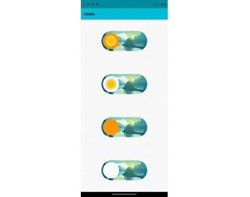
A customizable toggle switch widget to add asset background images to the toggle switch.
Features
Use this package to give fancy background images to the switch for your app.
Parameters
-
Required
bool value: A boolean value that determines whether the switch is active or not.ValueChanged<bool> onChanged: A callback function called whenever the switch is tapped.double height: A double value that sets height of the switch.String activeModeBackgroundImage: A string value that contains the path of the asset background image when the switch is active.String inactiveModeBackgroundImage: A string value that contains the path of the asset background image when the switch is inactive.
-
Optional
Color activeThumbColor: Sets color of the thumb when the switch is active. Default value isColors.white.Color inactiveThumbColor: Sets color of the thumb when the switch is inactive. Default value isColors.white.Image activeThumbImage: Used to give image to the thumb when the switch is active.Image inactiveThumbImage: Used to give image to the thumb when the switch is inactive.
Getting started
- Add the package to your dependencies
dependencies:
  fancy_switch: ^0.0.1
- Import the package to the dart file
import 'package:fancy_switch/fancy_switch.dart';
- Use it as widget wherever it is convenient
class _MyHomePageState extends State<MyHomePage> {
  @override
  Widget build(BuildContext context) {
    return Scaffold(
      appBar: AppBar(
        title: const Text('Demo'),
        actions: [
            FancySwitch(
                value: foo,
                onChanged: foobar,
                height: 25,
                activeModeBackgroundImage: 'assets/active_mode_background_color.png',
                inactiveModeBackgroundImage: 'assets/inactive_mode_background_color.png',
            ),
        ],
      ),
    );
  }
}
Usage
Switching between dark mode and light mode using FancySwitch
Support the pacakge (optional)
If you find this package useful, you can support it for free by giving it a thumbs up at the top of this page. Here’s another option to support the package:
Contributing to this package
If you would like to contribute to the package, go here.
