A customizable segment tab control. Can be used with or without TabView.
Features
The package provides an advanced segmented control widget based on the TabController.

Getting started
To use the package, add the dependency to the pubspec.yaml file.
dependencies:
  ...
  animated_segmented_tab_control: any
And import the library.
import 'package:animated_segmented_tab_control/animated_segmented_tab_control.dart';
Usage
The package contains a SegmentedTabControl widget that requires a SegmentTab list.
SegmentedTabControl(
  tabs: [
    SegmentTab(
      label: "Home".
    ),
  ],
)
SegmentedTabControl also requires a TabController. You can provide it with a DefaultTabController or instantiate a TabController instead.
DefaultTabController(
  length: 2,
  SegmentedTabControl(
    tabs: [
      SegmentTab(
        label: "Home",
      ),
      SegmentTab(
        label: "Account",
      ),
    ],
  )
)
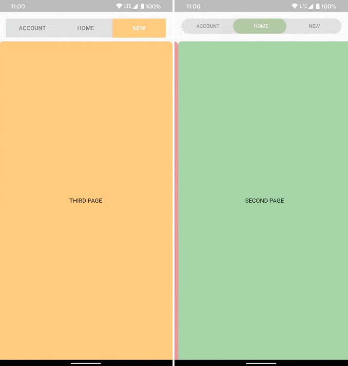
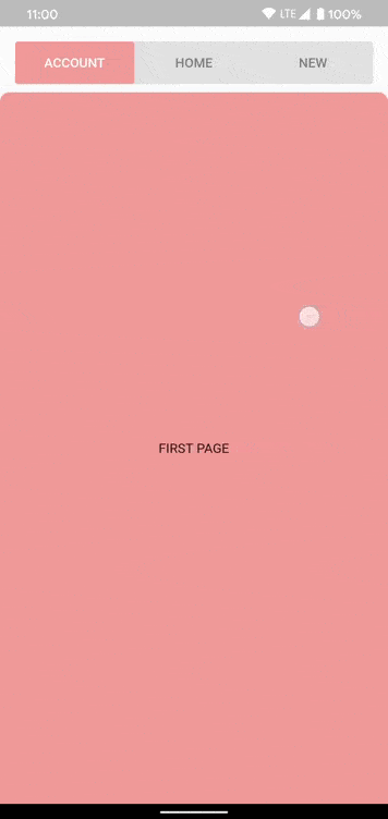
You can change the entire widget or an individual tab. Or combine it. All provided values in the SegmentedTabControl will be replaced with values from each tab.
SegmentedTabControl(
  backgroundColor: Colors.grey.shade300,
  indicatorColor: Colors.orange.shade200,
  tabTextColor: Colors.black45,
  selectedTabTextColor: Colors.white,
  tabs: [
    SegmentTab(
      label: 'ACCOUNT',
      color: Colors.red.shade200,
    ),
    SegmentTab(
      label: 'HOME',
      backgroundColor: Colors.blue.shade100,
      selectedTextColor: Colors.black45,
      textColor: Colors.black26,
    ),
    const SegmentTab(label: 'NEW'),
  ],
),
Change tracking logic is identical to TabBar logic.
DefaultTabController.of(context).index
or
_controller.index
You can find more examples here: https://github.com/LanarsInc/animated-segmented-tab-control/tree/main/example
Additional information
If you have any ideas or are running into a bug, please submit an issue on github page: https://github.com/LanarsInc/animated-segmented-tab-control/issues