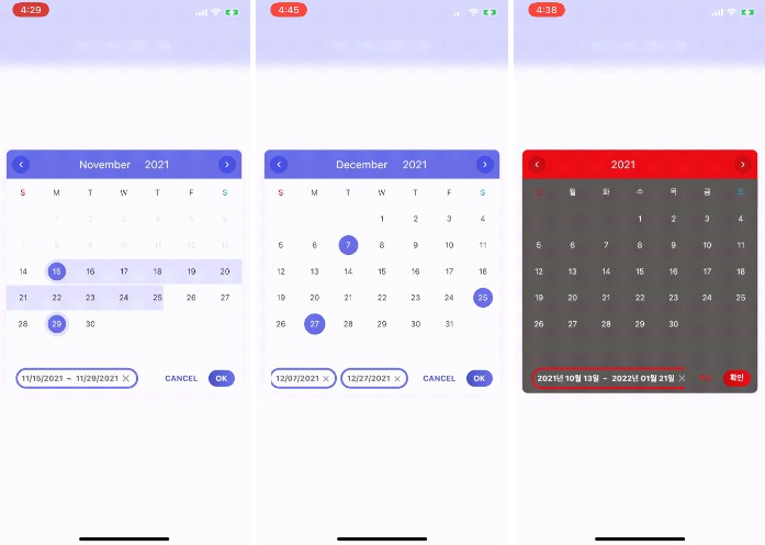
Cool datepicker
Features
- It’s the best datepicker ui ever. (at least for me ?)
- It’s possible to set all colors of datepicker
- Support selected date list at the bottom. User can move selected date to selected year and month.
- “COOL”
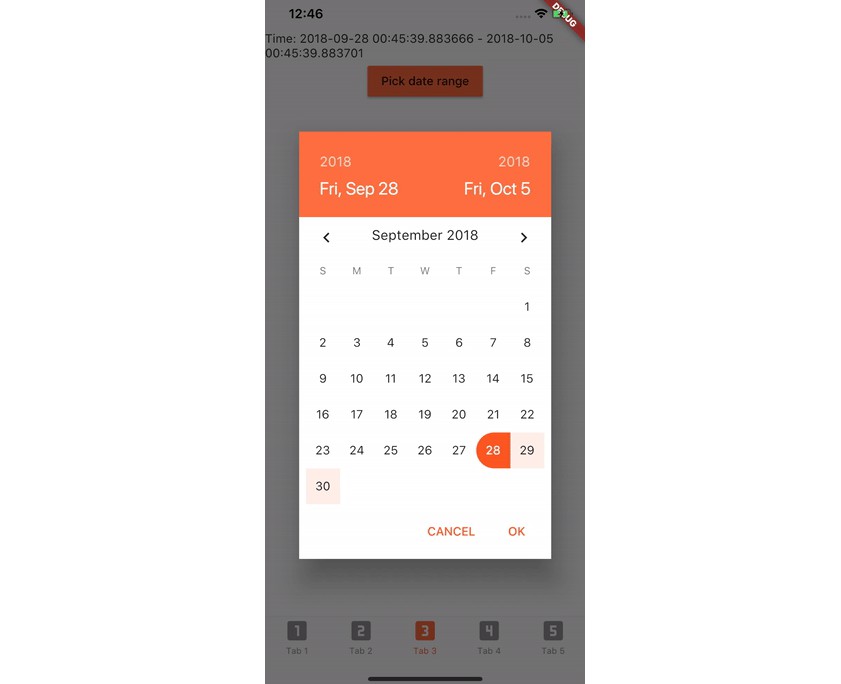
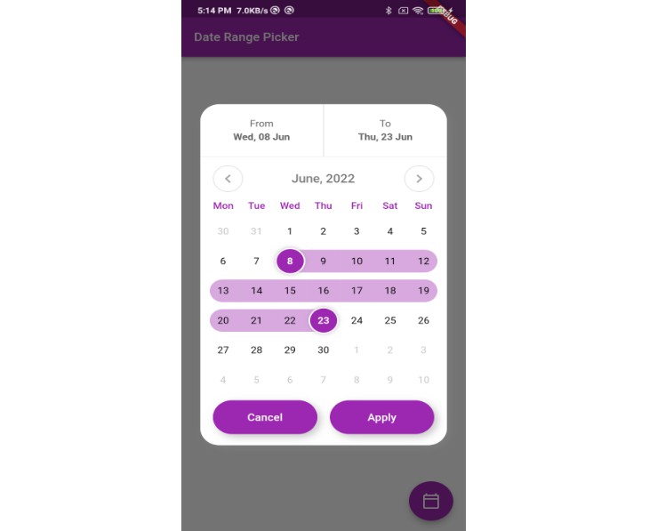
Samples
Installing
command:
$ flutter pub add cool_datepicker
pubspec.yaml:
dependencies:
  cool_datepicker: ^(latest)
Usage
import 'package:cool_datepicker/cool_datepicker.dart';


    CoolDatepicker(onSelected: (_) {})
Important options
| option |
Type |
Default |
Description |
| onSelected |
Function |
required |
when user selects dates and then click the ok button, it’s triggered. You must put one parameter in the Function. (ex. onChange: (a) {}).Then, you will get return List<DateTime> / Map<String, DateTime> |
| defaultValue |
List<DateTime> / Map<String, DateTime> |
null |
Default selected dates. It will automatically detects single/range depends on which type you use |
| disabledList |
List<DateTime> |
null |
disabled dates list. You must pass List<DateTime> |
| disabledRangeList |
List<Map<String, DateTime>> |
null |
disabled dates range map. You must use ‘start’ and ‘end’ key on the Map<String, DateTime> |
| isRange |
bool |
false |
datepicker for single/range |
    CoolDatepicker(
        defaultValue: [DateTime(2020, 8, 24)], // single select
        onSelected: (_) {},
        disabledList: [DateTime(2021, 10, 22), DateTime(2021, 10, 12)],
        disabledRangeList: [
            {
            'start': DateTime(2021, 11, 1),
            'end': DateTime(2021, 11, 13)
            },
        ],
    )
    CoolDatepicker(
        defaultValue: { // range select
        'start': DateTime(2020, 9, 25),
        'end': DateTime(2021, 11, 24)
        },
        onSelected: (_) {},
    )
Result options
| option |
Type |
Default |
Description |
| iconSize |
double |
20 |
Datepicker icon size |
| resultWidth |
double |
220 |
|
| resultHeight |
double |
50 |
|
| resultBD |
BoxDecoration |
below code |
BoxDecoration of the result |
| resultTS |
TextStyle |
below code |
TextStyle of the result |
| resultPadding |
EdgeInsets |
below code |
Padding of the result |
| isResultIconLabelReverse |
bool |
false |
Reverse order of the result by row |
| labelIconGap |
double |
10 |
Gap between the label and icon |
| isResultLabel |
bool |
true |
Show/hide the label of the result |
| placeholder |
String |
null |
|
| placeholderTS |
TextStyle |
below code |
|
| iconSize |
double |
20 |
the size of the calendar icon in resultBox |
resultBD = BoxDecoration(
          color: Colors.white,
          borderRadius: BorderRadius.circular(10),
          boxShadow: [
            BoxShadow(
              color: Colors.grey.withOpacity(0.1),
              spreadRadius: 1,
              blurRadius: 10,
              offset: Offset(0, 1),
            ),
          ],
        );
resultTS = TextStyle(
            fontSize: 20,
            color: Colors.black,
          );
resultPadding = const EdgeInsets.only(left: 10, right: 10);
placeholderTS = TextStyle(color: Colors.grey.withOpacity(0.7), fontSize: 20);
Datepicker options
| option |
Type |
Default |
Description |
| calendarSize |
double |
400 |
Datepicker size |
| minYear |
double |
DateTime.now().year – 100 |
Datepicker minimum year |
| maxYear |
double |
DateTime.now().year + 100 |
Datepicker maximum year |
| format |
string |
‘yyyy-mm-dd’ |
Format to show as result and bottom selected dates |
| limitCount |
int |
1 |
Set how many dates can be picked |
| weekLabelList |
List |
below code |
Set week words on the datepicker |
| monthLabelList |
List |
below code |
Set month dropdown label on the datepicker datepicker |
| isYearMonthDropdownReverse |
bool |
false |
Reverse order of dropdowns on the datepicker |
| headerColor |
Color |
Color(0XFF6771e4) |
Reverse order of dropdowns on the datepicker |
| arrowIconAreaColor |
Color |
Color(0XFF4752e0) |
Reverse order of dropdowns on the datepicker |
| selectedCircleColor |
Color |
Color(0XFF6771e4) |
Reverse order of dropdowns on the datepicker |
| selectedBetweenAreaColor |
Color |
Color(0XFFe2e4fa) |
Reverse order of dropdowns on the datepicker |
| cancelFontColor |
Color |
Color(0XFF4a54c5) |
Reverse order of dropdowns on the datepicker |
| okButtonColor |
LinearGradient |
below code |
Reverse order of dropdowns on the datepicker |
| bottomSelectedBorderColor |
Color |
Color(0XFF6771e4) |
Reverse order of dropdowns on the datepicker |
| isDark |
bool |
false |
dark mode |
| cancelBtnLabel |
String |
‘CANCEL’ |
Cancel button label |
| okBtnLabel |
String |
‘OK’ |
Ok button label |
weekLabelList = ['S', 'M', 'T', 'W', 'T', 'F', 'S'];
monthLabelList = ['01', '02', '03', '04', '05', '06', '07', '08', '09', '10', '11', '12'];
okButtonColor = const LinearGradient(colors: [
    Color(0XFF4a54c5),
    Color(0XFF6771e4),
]);
GitHub
View Github