Flutter contextual action bar(CAB)
A Contextual action bar workaround for flutter.
CAB & Flutter
CAB is a top app bar that replace the application app bar to provide contextual actions to selected items. Check the material implementation and requirement here
Flutter does not natively support CAB yet. see issue
Until CAB is natively supported, this package should provide you with an elegant way to implement the contextual action bar in flutter.
How it works
ContextualScaffoldorContextualScrollView(for slivers)ContextualAppBarContextualActionContextualActionWidget
ContextualScaffold<?>
The ContextualScaffold<?> is similar to the normal material Scaffold except that it also takes
a required contextualAppBar.
ContextualScaffold<?>(
      contextualAppBar: ContextualAppBar(),
      appBar: AppBar(),
      body: Body(),
    )
You can provide multiple ContextualScaffold as needed
ContextualScrollView<?>
The ContextualScrollView<?> is similar to the normal NestedScrollview except that it also takes a required contextualAppBar.
 ContextualScrollView<?>(
     contextualAppBar: ContextualAppBar(),
     headerSliverBuilder: (BuildContext context, bool innerBoxIsScrolled) => [],
     body: Body(),
  )
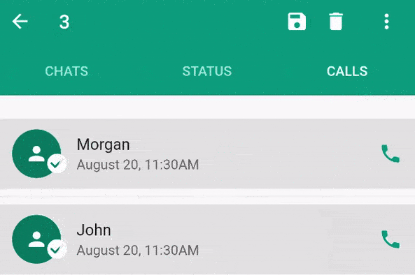
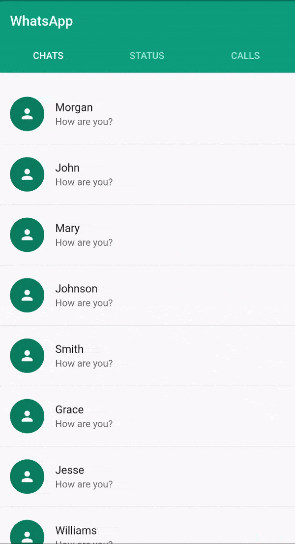
The ContextualScrollView is used to add first class support for silvers although ContextualScaffold can also be used with NestedScrollview check the WhatsApp example for complete usage.
ContextualAppBar<?>
The ContextualAppBar<?> is similar to the normal material Appbar but takes a counterBuilder instead of title and also a contextualActions instead of actions.
 ContextualAppBar(
      counterBuilder: (int itemsCount){
        return Text("$itemsCount Selected");
      },
      contextualActions: <ContextualAction>[],
    )
ContextualAction<?>
The ContextualAction<?> allows you to take actions on the selected items, with the help of itemsHandler callback.
ContextualAction(
            itemsHandler: (List<?> items) {
              items.forEach((item) {
                Scaffold.of(context).showSnackBar(SnackBar(
                  content: Text("$item saved"),
                ));
              });
            },
            child: Icon(Icons.save),
          ),
ContextualActionWidget<?>
You can use the ContextualActionWidget anywhere in the ContextualActionScaffold or ContextualScrollView<?> body to notify ContextualActionScaffold or ContextualScrollView<?> respectively, that an item have been selected in order to show the ContextualAppBar.
   ContextualActionWidget(
          data: ?,
          child: ChildWidget(),
        )
Note: It is important that the child widget does not handle onLongPress.
A closer look at ContextualActionWidget<?>
The ContextualActionWidget<?> takes other optional parameters like
selectedColorselectedWidgetunselectedWidget
The selectedColor is the color of the background for the selected item, it defaults to the splash color, if not provided. The selectedColor works well with ListTile.
selectedWidget and unselectedWidget are stacked on top of the provided child widget. By default, they are positioned at the center of the provided child widget.
Since They are stacked, you can use Row, Align, Positioned Widget or any other combination of widgets to position them where desired.
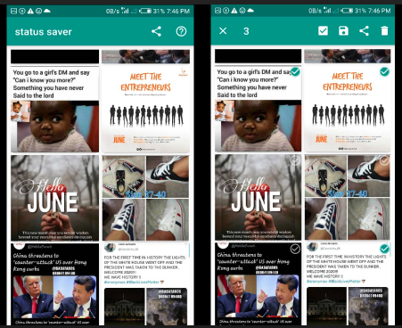
The selectedWidget is shown when the ActionMode is enabled and the item is selected, while the unselectedWidget is shown when ActionMode is enabled and the item is not selected. See example(status_saver) image below with both the selectedWidget and unselectedWidget aligned to the top-right corner.
ActionMode
This contextual action bar workaround does not support zero item in the ActionMode.
-
Use the
ActionMode.addItem<?>to add an item to the selected items. If this is the first selection, theActionModeis will be enabled. -
Use the
ActionMode.addItems<?>to add a list of items. -
Use the
ActionMode.disable<?>to disable and deselect all selected items. -
Use the
ActionMode.enabledStream<?>to emit true or false depending on if the Action mode is enabled or disabled respectively.
Note: In most cases, you won't need to use ActionMode.disable<?> because the package already do that for you where needed.