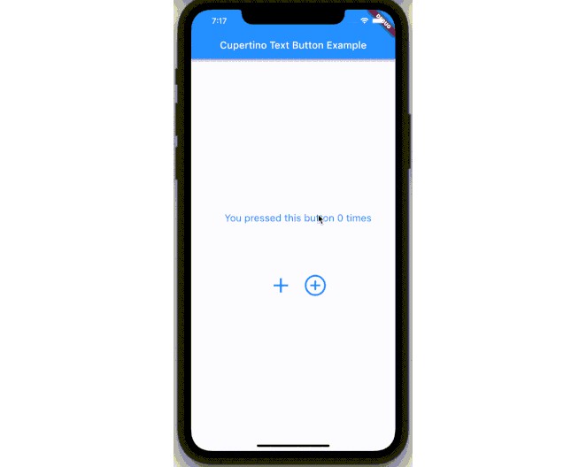
Cupertino Text Button
A button that looks like a Cupertino text button!
Text Button
A simple text button can be created like this:
CupertinoTextButton(
    text: 'Apply',
    style: const TextStyle(fontSize: 20),
    onTap: () {
        // Do your text stuff here.
    },
),
For text buttons you can configure the following properties:
| Property | Type | Description |
|---|---|---|
| text | String | Title of the button |
| style | TextStyle | Text style of the title |
| textAlign | TextAlign | Text alignment of the button |
| textDirection | TextDirection | The text direction to use for rendering the text |
| textOverflow | TextOverflow | The text direction to use for rendering the text |
| softWrap | bool | Whether the text should break at soft line breaks |
Material Icon Button
A simple material icon button can be created like this:
CupertinoTextButton.materialIcon(
    icon: Icons.chevron_left,
    size: 30,
    onTap: () {
        // Do your icon stuff here.
    },
),
For material icon buttons you can configure the following properties:
| Property | Type | Description |
|---|---|---|
| icon | IconData | Icon to display |
| size | double | Size of the icon |
| textDirection | TextDirection | The text direction to use for rendering the icon |
Common Properties
Either you creating a text or an icon button, you can specify these properties:
| Property | Type | Description |
|---|---|---|
| onTap | Function | On tap handler of the button |
| onLongPress | Function | On long press handler of the button |
| normalColor | Color | Foreground color of the button in normal state, e.g. not pressed |
| pressedColor | Color | Foreground color of the button in pressed state |
| forwardDuration | Duration | Duration of the animation from normalColor to pressedColor |
| backwardDuration | Duration | Duration of the animation back from pressedColor to normalColor |
| curve | Curve | The animation curve. |
Theme
All these shared properties, except for the onTap and onLongPress ones, can be configured via the CupertinoTextButtonTheme. Just wrap it around your app or any other parent widget above CupertinoTextButtons in the tree like this:
CupertinoTextButtonTheme(
    normalColor: Colors.white,
    pressedColor: Colors.orange,
    /* forwardDuration, backwardDuration and curve can also be configured here. */
    child: Row(
        children: [
            CupertinoTextButton(
                text: 'First Option',
                style: const TextStyle(fontSize: 20),
                onTap: () {
                    // Do your first stuff here.
                },
            ),
            CupertinoTextButton(
                text: 'Second Option',
                style: const TextStyle(fontSize: 20),
                onTap: () {
                    // Do your second stuff here.
                },
            ),
        ],
    ),
)
And both of these text button will have the same colors!
If these properties are not specified in the button and no theme is provided, fallback values are used:
| Property | Fallback Value |
|---|---|
| normalColor | Colors.black |
| pressedColor | Theme*.primaryColor |
| forwardDuration | const Duration(milliseconds: 20) |
| backwardDuration | const Duration(milliseconds: 200) |
| curve | Curves.fastOutSlowIn |
* Theme — the default Flutter Theme.
